Handcrafted sprays and oil elixirs.
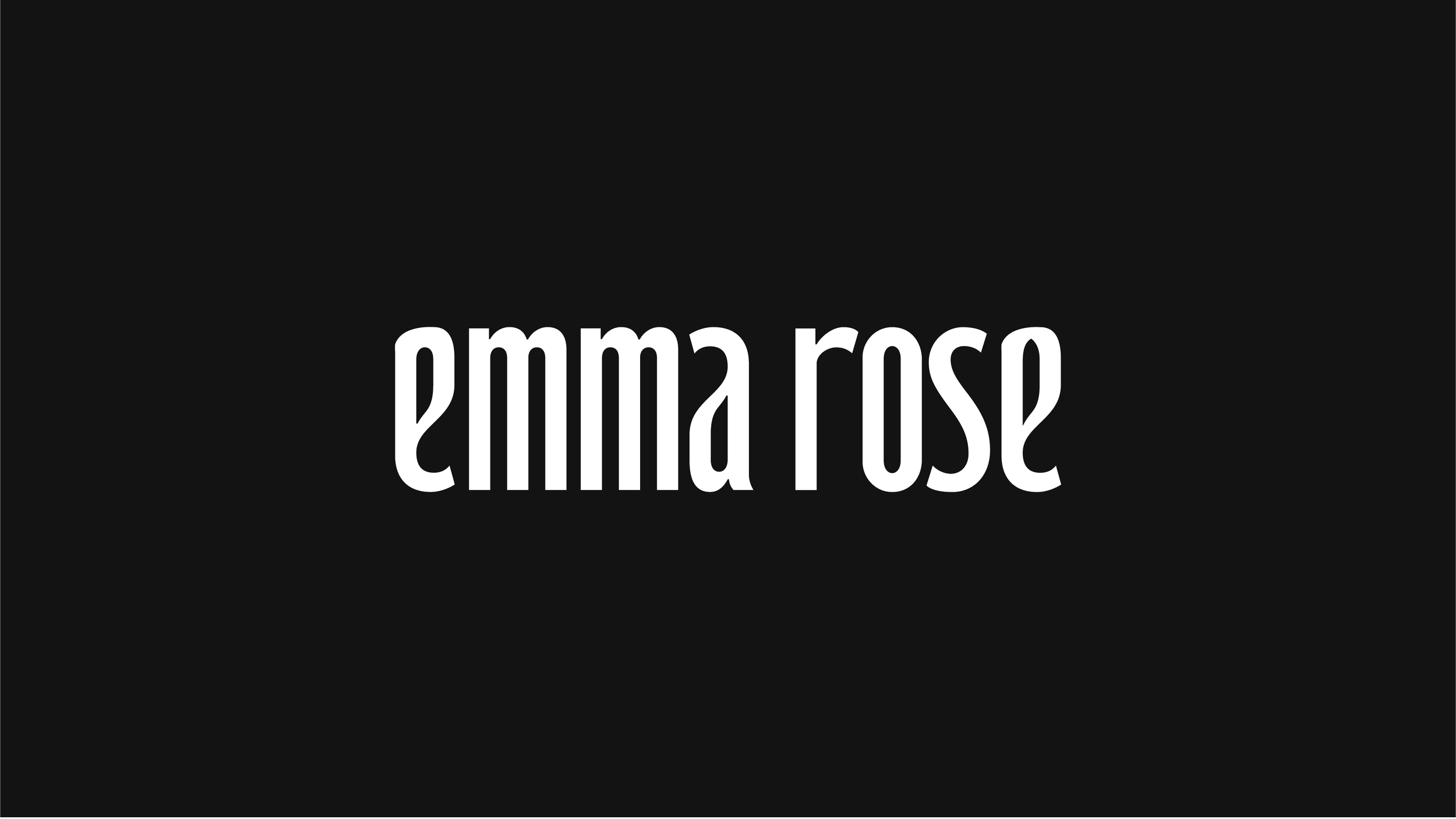
EMMA ROSE
〰️
EMMA ROSE 〰️
Project
Overview
Elixirs for awakening.
Emma Rose’s first collection of oils and sprays needed a brand mark and packaging identity that inspired balance between strength and softness, masculine and feminine. We developed a timeless brand mark in combination with an iconography system to be applied on packaging and accompany each scent. The packaging identity speaks to balance between softness (feminine) and strength (masculine). Additionally, the brand mark is strengthen by symmetry in the letterforms that together create a sense of rhythm and balance.
Client Emma Rose
Sector Handcrafted
Discipline Brand Development
Services Visual Identity, Strategy, Packaging, Photoshoot, Creative Direction